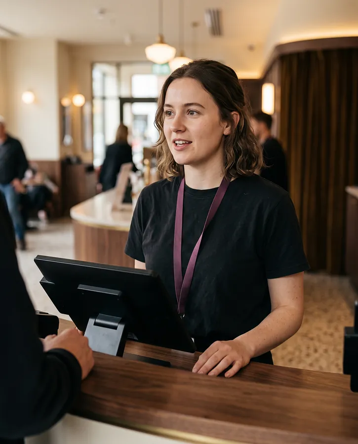
Cashier
Box office and concessions
- Worst ten minutes
- The queue before the 19:30 shows.
- Needs
- Tickets and food in one basket, seats in two taps, the total always in the same place.
Houselights is a concept redesign of a legacy Windows till for a cinema that also runs a kitchen: one touch-first system for the box office, concessions, table service and the kitchen line, with a browser back office for planners.
Live prototype
Problem
Cinema tills tend to grow one module at a time. Tickets, concessions and the restaurant end up on separate screens with separate baskets, built around F-keys and a mouse. Staff work around it every night, and every new starter has to learn the shortcuts before they can serve a queue.
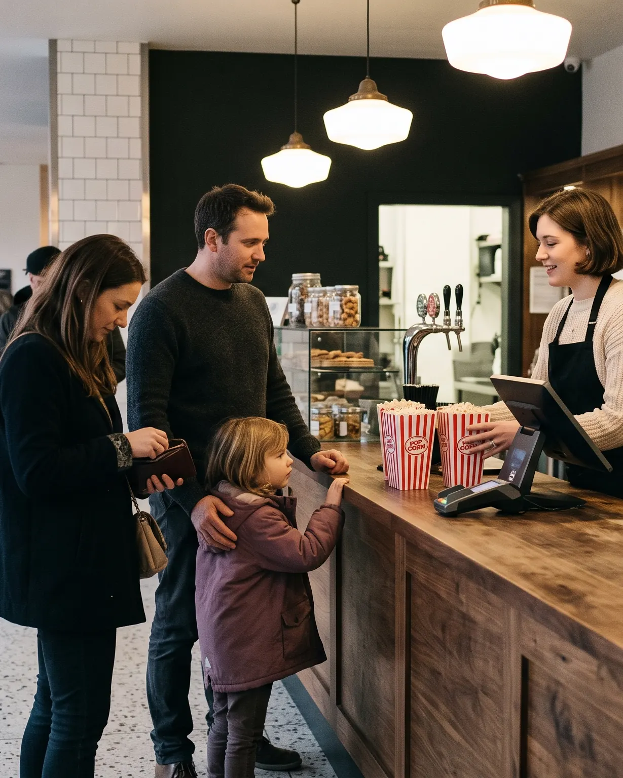
Tickets and popcorn are two transactions, so a family pays twice and the queue waits twice.
Tickets, food, drinks and rewards sit in one order. Food for a Lounge screening can go straight to a seat.
Fast for veterans, slow for new starters, and useless on touch glass.
44 px minimum targets, 56 px for everyday actions and a 64 px Charge button that never moves.
“151/180” says nothing about where two people can sit together.
Every showtime has a fill bar and a count, and one tap opens a seat map with Best seats.
A comp ticket freezes the screen until a manager walks over with a PIN.
Comps and refunds go to the duty manager's phone, and the cashier keeps serving.
Sold out, paused and allergy notes look the same, so the important ones get missed.
Colour, an icon and plain words together, so nothing depends on colour alone. Allergies are red on every screen they reach.
People
I designed every surface around the moment its user is under the most pressure, because that is where a till earns or loses trust.
Box office and concessions
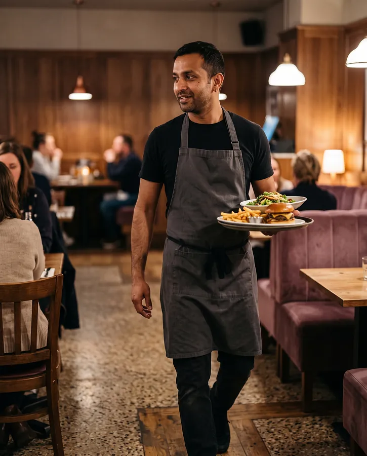
Restaurant and in-seat
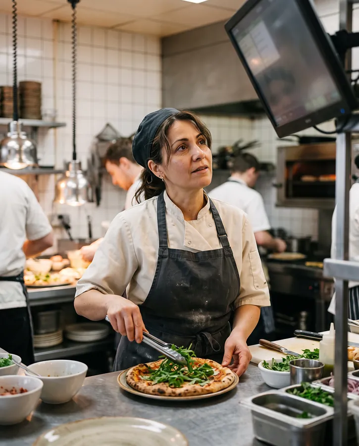
Hot line and pass
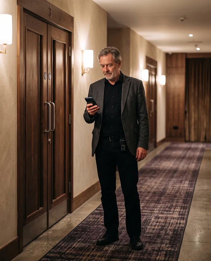
Everywhere, phone in hand
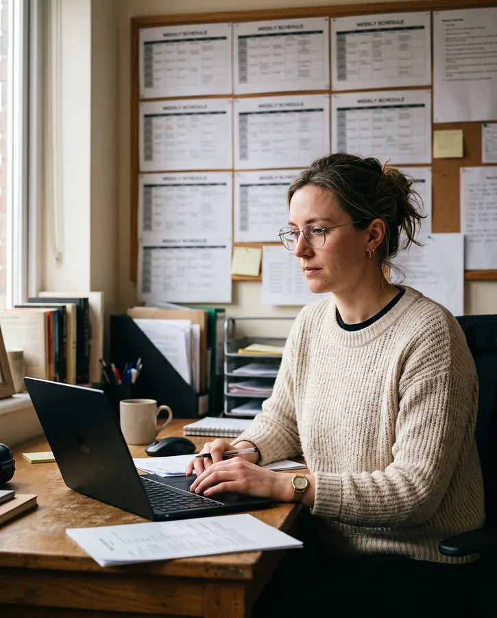
Back office, at a desk
Screens
Every screen below is live. Tap through them the way staff would; nothing is sent or charged.
The schedule is the till's home screen. Every showtime carries its own availability, so a cashier can answer “anything at half seven?” without opening a session.
Concessions pay for the cinema. The fast path is the default and the profitable path is one tap away.
Most diners here have tickets. The table knows which screening its party is going to, so held desserts can follow them to their seats.
The kitchen display is dark and readable from the pass. It is the one surface where motion earns its place: timers count up live.
Attaching a customer at the start changes what the till offers: member prices, rewards, and allergies that follow the order into the kitchen.
Planners work at a desk with a mouse and a deadline. The office runs in the browser, uses the same tokens as the tills and fits more on screen.
Process
Operational software gets judged on a busy Friday, not in a review meeting, so the work starts and ends with the people using it. I agree the first release, the phases after it and the deliverables before any screens.
Stakeholder interviews, a shadowed evening shift at the box office, bar and pass, timed tasks on the current till, and a list of the hardware in use.
Roles and permissions, information architecture, core flows, and a written first release with the phases after it.
Wireframes, then high-fidelity screens and a component library in light and dark, alongside a clickable prototype.
Sessions with staff from each role on real terminals, with tap counts and time on task compared against the current till.
Specs for every state and edge case, annotated flows, and weekly design QA with the developers.